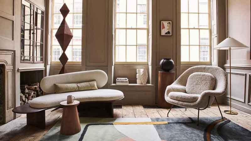
What’s hot in home Interiors for 2021?

Thinking of updating your window blinds or changing the décor around home? Here's what's hot in the world of home interiors colours.
Whether you choose them for your walls, furniture, window blinds or accessories, we’ve split them into three sections, starting with colours at the more muted end of the scale through to the loud and proud!
If you like it natural and neutral…
Find your inspiration in natural materials like wood, tree bark and stone.
A key shade that’s been gaining traction in this area is best described as ‘mushroom’. It’s not grey, it’s not brown, it’s not dark but it is rich.
White will always have its place in interior design but this year we’re seeing more darker whites closer to off-cream or even beige. Choose one with a bold undertone to achieve the best of a neutral colour palette and a pop of energy.
If you like colour…but not too much
Some are calling pastels the new neutral – think light, milky, ice cream colours like lilac, avocado, peach, dusty pink and misty blue. They’re calming and look beautiful layered with darker shades of the same colour, especially when it comes to window treatments.
Terracotta was big in the 90s and now it’s back! This is a lovely compromise between opting for a neutral tone but choosing something with a bit of personality. Other earthy colours in this realm are also trending – think caramel, clay, cinnamon or even burnt orange.
If you’re wanting a pop of colour in a darker tone, there are some gorgeously muted dark purples, blues and reds this season across window blinds. With names like ‘merlot’, ‘night berry’ and ‘charcoal blue’ you can tell these are colours with depth that won’t overwhelm a room.
For those who LIVE for colour…
When you’re bold enough to splash colour about, your options are almost endless. But beware, the bolder and brighter the colour, the faster it dates and the easier it is for the overall look of your room to go skewiff by mismatching furniture and accessories.
If you want vibrancy, energy and playfulness in 2019, jewel tone colours (eg. emeralds, sapphires, and aquamarines) are still very popular.
Electric citrus tones are another re-emergence from the 90s/early 2000s – lime green, sunny yellow and electric orange are popular right now.
Pantone’s Colour of the Year for 2019 is called ‘Living Coral’, a bright and beautiful orangey hue with a golden undertone; it’s both vibrant but chilled at the same time.
Here’s something new – colour inspired by artificial lighting! These are high-intensity shades (particularly in purples and blues) that mimic how our eyes perceive colour under artificial lighting.
If light and bright isn’t your particular taste in colour, deeper shades trending in 2019 include forest greens with bluey undertones and near-black purples. Of course, whatever colour you choose for your home, when it comes to matching the perfect window blinds, we’re experts in custom-made window blinds with a wide range to choose from. Servicing the entire Auckland area, get in touch for a free in-home consultation and have new blinds installed this summer to give your house a great new modern look.

